Every day, thousands of drivers cruise down busy Kansas roadways like Kellogg Avenue in Wichita or Wanamaker Road in Topeka. The big question is: how many of them actually notice your business as they pass by? In a world full of driving distractions, catching a motorist’s eye requires a bold statement, and that is exactly what monument signs are built to do. Simply setting up a sign near the road, however, isn’t enough to guarantee results. To truly cut through the roadside clutter and pull drivers into your parking lot, your signage must be engineered with specific, high-visibility design features that demand attention.
How Do Size, Shape, and Placement Influence the Visibility of Monument Signs?
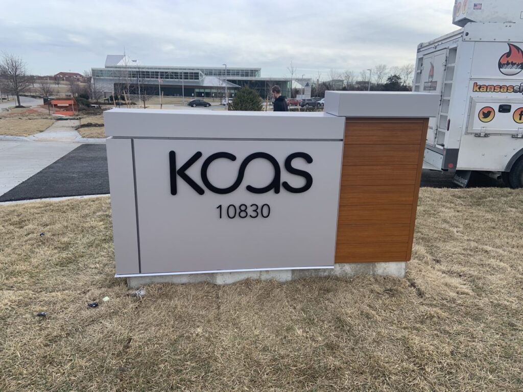
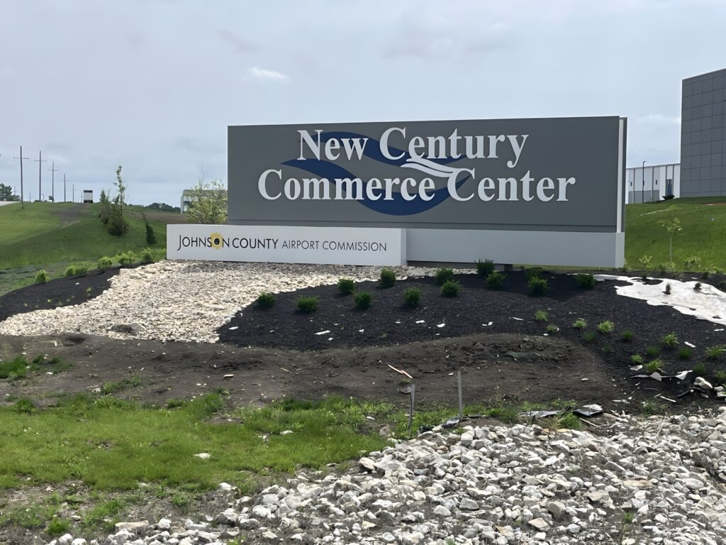
The physical structure of your sign dictates how quickly a driver can spot and process your messaging. Size is the first critical factor. Monument signs must be scaled appropriately for the speed limit of the adjacent road; larger, taller structures are required along highway corridors to give drivers enough time to read them, while smaller profiles suit downtown streets. Shape also plays a vital role. While standard rectangular bases are classic, unique architectural curves or geometric angles break visual monotony, instantly drawing the eye away from surrounding foliage or buildings.
Placement can make or break your investment. A sign must be positioned clear of utility poles, trees, and parked cars, angled perfectly perpendicular to oncoming traffic. In Kansas, local zoning laws heavily regulate setback distances and maximum heights, making it crucial to work with professionals who understand how to maximize placement within local legal boundaries.
What Role Do Color Contrast, Lighting, and Materials Play in Making Your Signs Stand Out?
Once the structural foundation is set, aesthetic elements determine readability. High color contrast is vital for quick comprehension. Using dark lettering against a light background—or vice versa—ensures that text doesn’t blur together at 45 miles per hour. Avoid low-contrast combinations like tan text on a brick base, which easily blend into the natural Kansas landscape.
Lighting is equally transformative, turning your sign into a 24/7 marketing asset. Internal LED illumination or chic faux-neon lettering ensures crisp readability during dark winter commutes and stormy Midwestern evenings. Finally, the choice of materials reinforces your brand identity while enhancing visibility. Matching premium materials like stone, brick, architectural metals, or heavy-duty stucco to your building’s exterior creates a sophisticated, cohesive look that commands authority and catches the eye of passing motorists.
Contact our team of Kansas commercial signage experts today to design and install custom monument signs tailored perfectly to your business goals!