High-visibility exterior and interior displays are critical investments for building brand recognition and drawing in local customers. In a competitive market, off-the-shelf options rarely cut it. Choosing the right custom signs helps your business stand out, communicate professionalism, and withstand local environmental demands. Selecting the ideal design, materials, and placement, however, requires careful planning.
What Factors Should You Consider When Choosing Custom Signs for Your Kansas Business?
Selecting custom signs involves evaluating practical, geographic, and regulatory considerations to maximize your return on investment:
- Kansas Weather Durability: Kansas experiences severe weather swings, from blazing summer heat and high winds to icy winters. Ensure your custom signs use weather-resistant materials like rust-proof extruded aluminum, heavy-duty polycarbonate, or UV-protected vinyl that won’t fade or crack.
- Location and Viewing Distance: A sign placed near a busy highway requires larger, bold typography readable from hundreds of feet away. A downtown foot-traffic display can feature intricate details. Consider sightlines, setback distances, and traffic speed when sizing your sign.
- Local Zoning and Permitting Laws: Municipalities like Wichita, Overland Park, or Topeka enforce specific zoning ordinances regarding sign height, square footage, illumination levels, and setbacks. Always review local city codes or work with a licensed professional to secure necessary permits before manufacturing.
- Illumination Needs: If your business operates during evening hours, choose an illuminated option—such as LED channel letters or backlit cabinet signs—to ensure 24/7 visibility.
How Do You Choose Custom Sign Designs That Match Your Brand and Attract Customers?
Your sign is often the very first impression a potential buyer has of your business. To ensure your design aligns with your brand identity while capturing customer attention:
- Maintain Visual Consistency: Use your exact brand colors, official typography, and logo assets. Consistent visuals reinforce brand recognition across your storefront, website, and vehicles.
- Prioritize High-Contrast Readability: Dark text on a light background (or vice versa) ensures quick readability for drivers passing by at high speeds. Avoid overly decorative fonts that clutter the message.
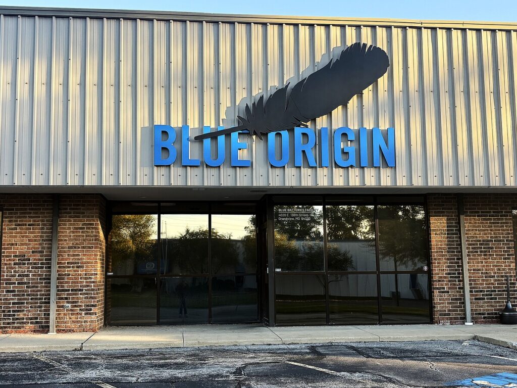
- Choose the Right Sign Type: Match the physical structure to your building’s architecture. Monument signs create an upscale entrance for corporate offices, while dimensional letters or blade signs work well for retail storefronts.
- Keep Messaging Clear: Limit your text to essential details—typically your business name, primary service, and address or logo.
Investing in tailored custom signs is one of the most effective ways to drive foot traffic and build long-term brand equity in your local community. If you are ready to design durable, high-impact signage tailored specifically to your site and brand goals, contact Prairie Fire Signs & Graphics today for a free design consultation and quote!