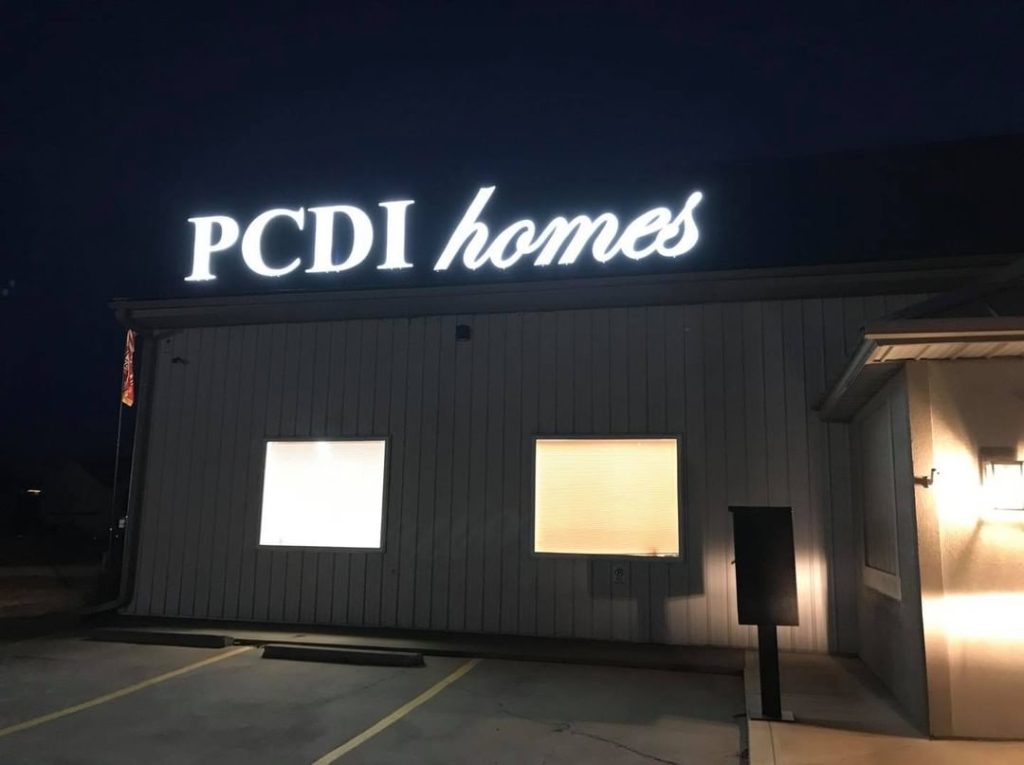
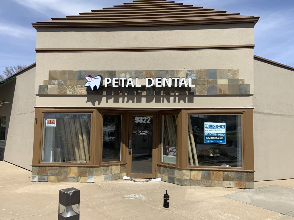
Channel letters are one of the most effective ways to advertise a business, but they must be designed in a way that’s both aesthetically pleasing and effective at conveying your brand’s message to passing pedestrians. Even the most attractive customized sign design, though, won’t garner much attention if it doesn’t also match the style of your business or industry.
Different Styles of Channel Letters

In traditional typography, the letter I is a capital i. However, in sign-making vernacular, the letter I refers to any letter that has a wider crossbar. These letters may be straight up or slanted. Below are examples of three common ways that channel letters are made:
- Straight-Up Roman I : This design consists of two lines as opposed to one line going down the middle. The advantage is that it is more visible and easier to read. The downside is that this design cannot be used in tight spaces because there are less options for spacing between words, and the widest point will always go in the same direction. An alternative to this style is the use of a serif at the bottom (or top) of the letter, which will allow for tighter spacing.
- Slant Roman I : A variant form of the previous style, this type uses only one stroke with a single angle (slightly diagonal). The upside is that these letters can fit in tighter spaces than an upright version, and they also have more variation with angles.
- Old Style Roman I : This type has a more rounded appearance with larger curves and pointed ends. These features make it much harder to distinguish what letter is being shown; therefore, these letters should not be used where space is limited. The upside is that these types of letters are easy to read when viewed head-on, so they work well as company logos in stationary or branding pieces such as business cards.
Nothing Says Creativity Like a Channel Letter Sign
Channel letters signs are more versatile than you might think; they’re not just limited to the front entrance of a retail store or an office building. They can also be used inside of buildings as well as in commercial or residential driveways where traffic needs to be directed. But here’s the catch: having the best graphic design in the world won’t make up for lackluster execution! That is, if your goal is to grab people’s attention and communicate a message quickly.
At Prairie Fire Signs & Graphics, we can help you design your channel letter sign to reflect your company’s brand and message you want to portray!

